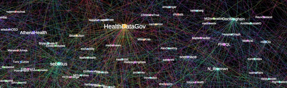
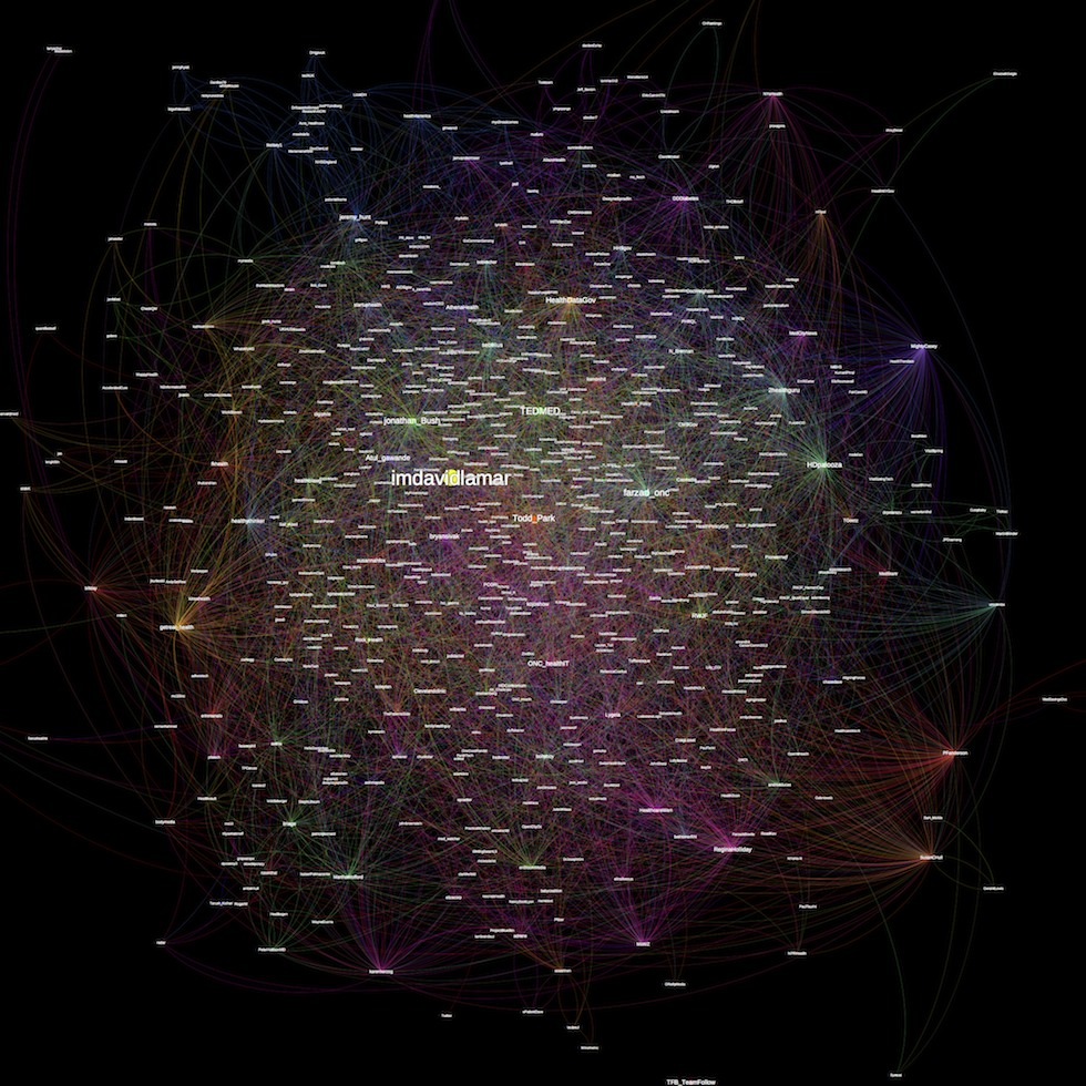
Health Datapalooza IV (#HDPalooza) just ended last night as the fourth annual national conference born from government efforts to liberate health data. Two conference days concluded with 11,141 tweets created! An amazing feat! In the same spirit of liberating health data, we have taken the data from Twitter and visualized it in the network centrality analysis shown above.
The larger the node, the more influential or central to the graph. Links between nodes signifies one of more direct conversations or mentions between two Twitter Users.
Download the PDF version to zoom in on the graph or even search for specific Twitter Users.