The Network Analysis widget has been upgraded with new features, including Community Detection functionality, and a new user interface for network graph settings.
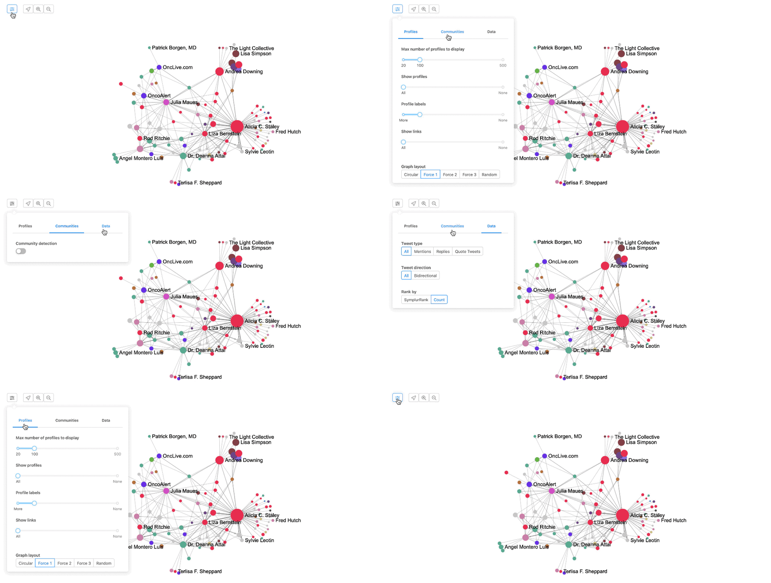
New Button: Network Analysis Settings
We have added a new button which now houses all the settings for the network graph. These settings are organized into three separate tabs, Profiles, Communities, and Data, described in detail below.
Profiles
The Profiles tab provides four sliders to help you surface the insights you’re seeking, as well as access to a variety of graph layout options.
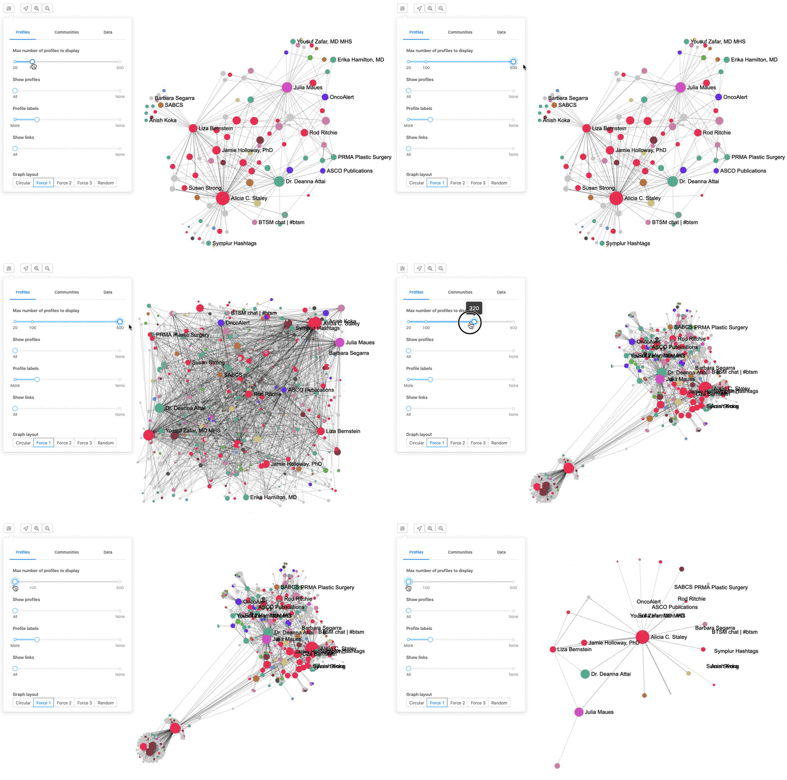
Slider #1: Max Number of Profiles to Display controls the maximum number of Twitter profiles to retrieve from the database and display on the network graph. The slider increases by increments of 10 and ranges from 20 to 500.
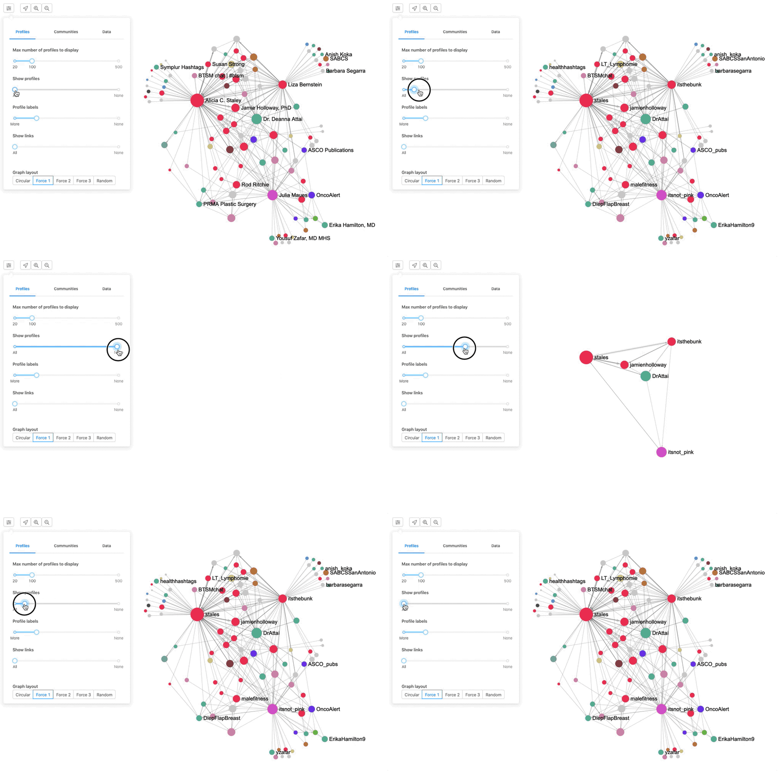
Slider #2: Show Profiles filters the current Twitter profiles on the network graph based on the size of the profile from the smallest to the largest (by default, profiles are ranked by SymplurRank). Moving the slider all the way to the right hides all profiles, and moving it all the way to the left shows all profiles.
Slider #3: Profile Labels controls the number of labels (Twitter Names) that are displayed on the network graph. Sliding the control to the right will show fewer labels, and sliding the control to the left will show more labels.
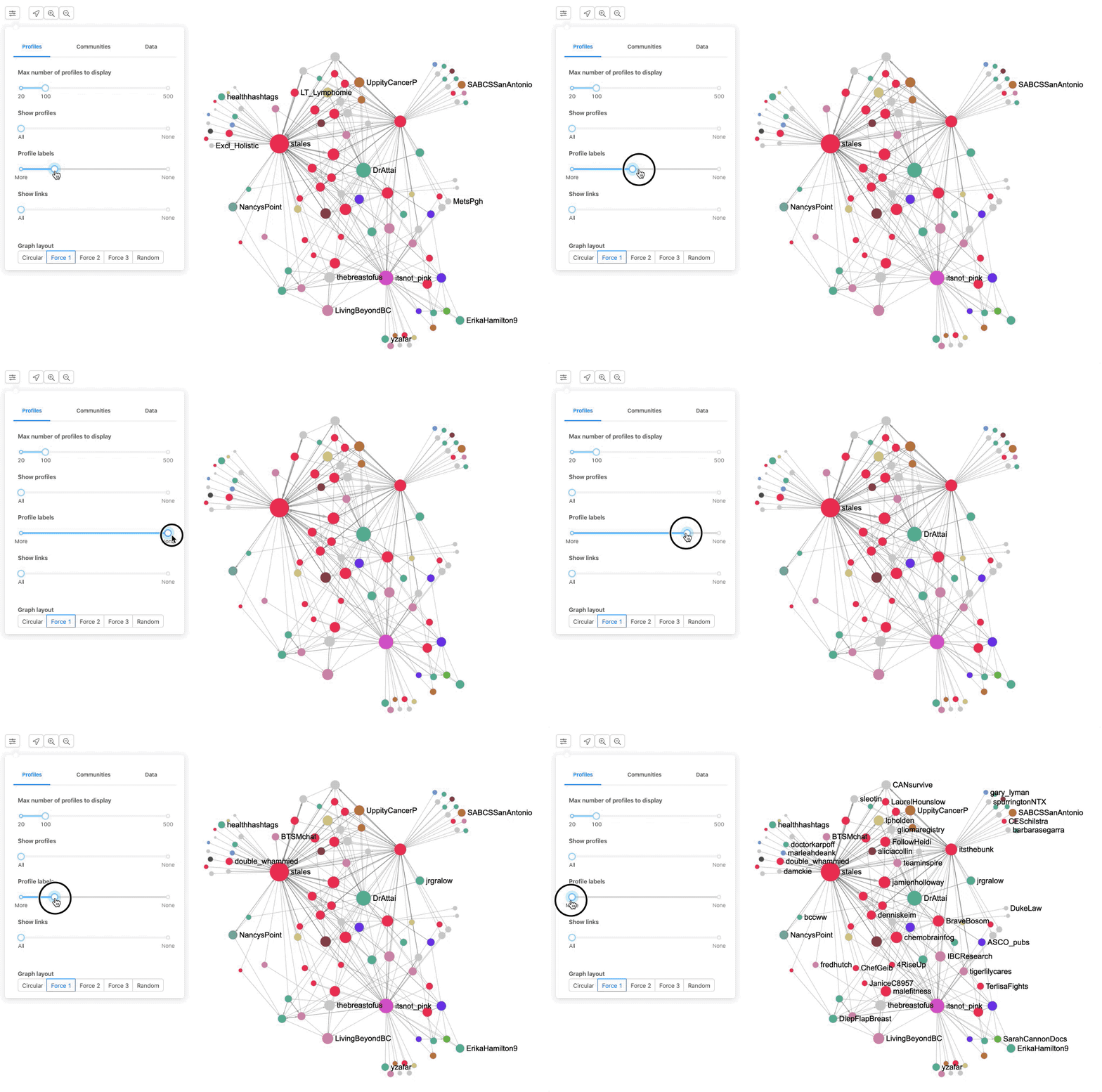
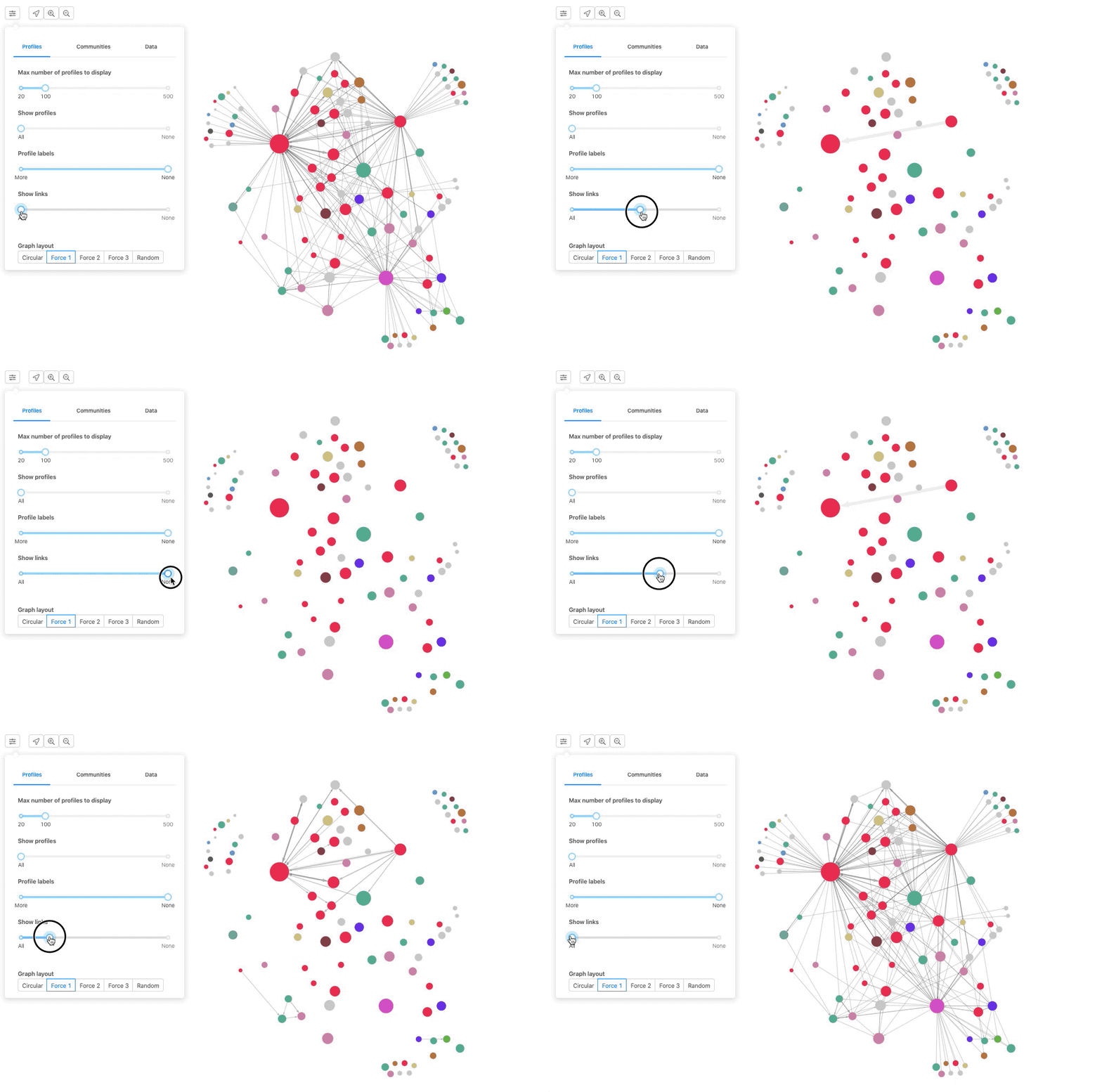
Slider #4: Show Links filters the connections, or links, between the profiles based on the score of the connection from the smallest to the largest. Moving the slider to the right will hide the links, and moving it to the left will show all the links. These links represents an engagement between two Twitter users, which can be a reply, a mention, a retweet or a quote tweet.
Graph Layout Options: Lastly, the five buttons at the bottom of the Profile Tab provide access to different graph layouts. Click on any of them to trigger the animation that generates the new layout of the graph based on your current data selections.

Communities Tab (New!)
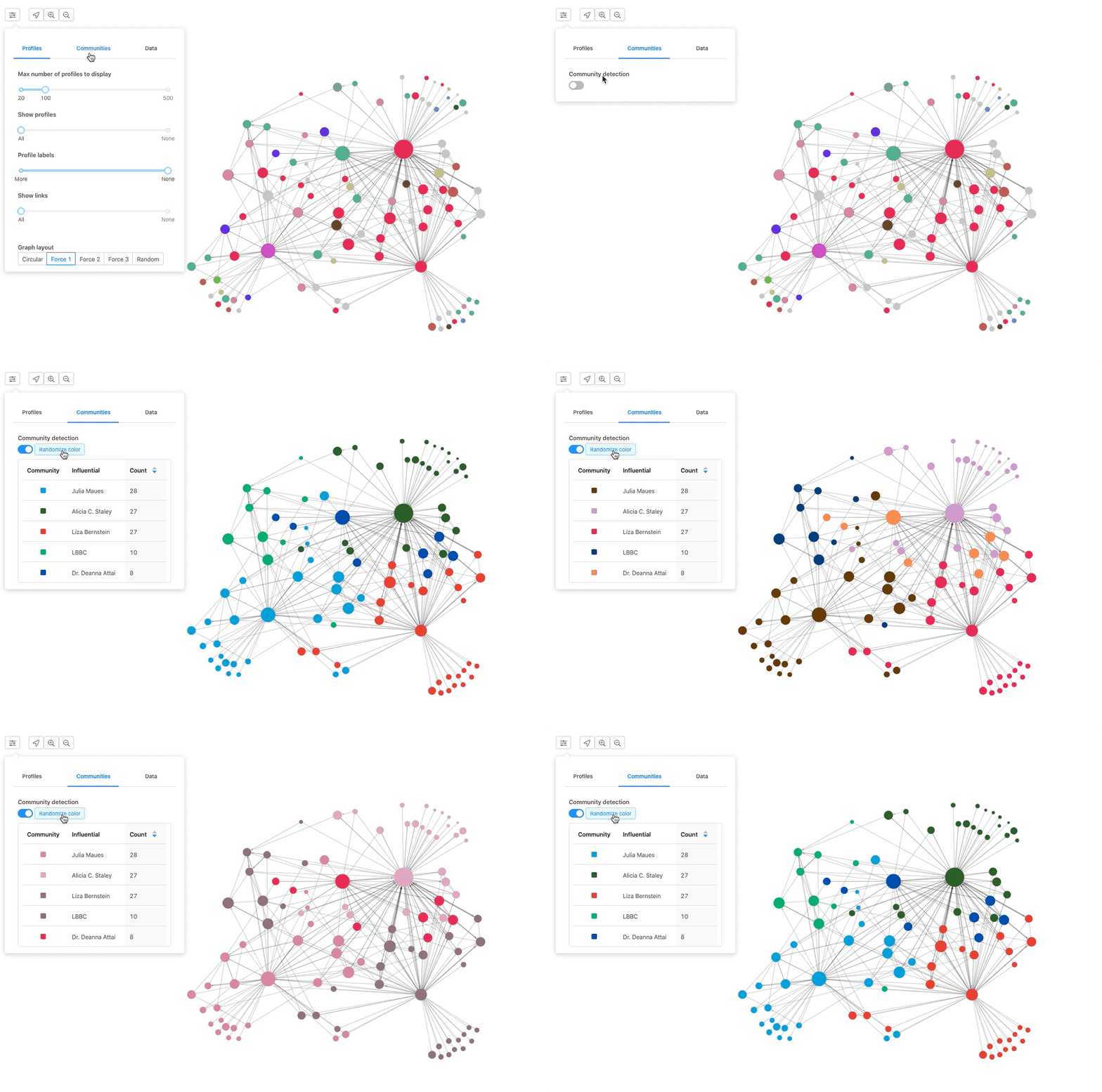
Community Detection is a new feature released with this update that identifies and builds a hierarchy of communities and sub-communities in the current network analysis. Simply toggle Community Detection and different colors will be assigned to each community or sub-community in the network graph.
Read here for additional details about this new functionality.
Data Tab
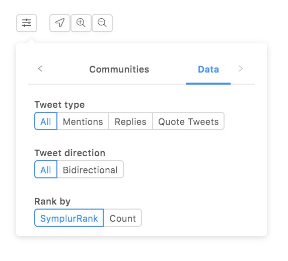
The data tab contains three settings to change the data source used for the network graph.
Tweet Type options refer to the types of connections, or links, that are generated between two individual accounts:
- All — (default) the connection is either a mention, a reply, or a quote tweet.
- Mentions — only mentions between accounts are drawn.
- Replies — only replies between accounts are drawn.
- Quote Tweets — only quote tweets between accounts are drawn.
Tweet Direction options refer to the direction of the arrows that connect two individual accounts:
- All — (default) all engagements that are either unidirectional or bidirectional, with the arrowhead showing the direction of the connection.
- Bidirectional — displays engagements where both users are mentioning each other, replying to each other, and/or quoting each other.
Rank By options, SymplurRank and Count, pertain to the algorithm used to retrieve the data for the network graph.
- SymplurRank is the default selection because it is more effective at filtering out retweet bots, spam accounts, and interactions that may not be pertinent.
- Count ranks accounts by their number of tweets.
